
Creating Packs from the Silverlight Application Themes
Published on Friday, January 21, 2011 5:13:00 PM UTC in
Programming

Some time ago Microsoft released the four Silverlight Application Themes Jet Pack, Accent Color, Windows 7 and Cosmopolitan. You can find that download here. The Themes are provided as comfortable installers and integrate as new templates into Visual Studio. The drawback of the loose style XAML files the themes come as is that they cannot be easily used as Toolkit compatible theme packs, which makes dynamic switching of themes difficult, for example. It also requires more effort than necessary to apply the styles in an already existing project. I decided to convert the themes into theme packs, but that turned out to be harder than expected. Read on for a step-by-step guide and an online demo with full source.
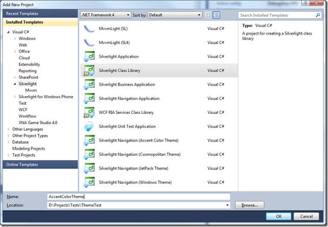
Create a class library project for the pack
The first thing you should do is create a class library that will contain your theme pack. This is nothing but a normal Silverlight class library:
Include the styles
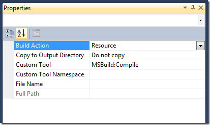
The next step is to include the styles required for the application theme in the class library (Add/Existing Item...). The zip file you have downloaded contained two folders, one with the installers for Visual Studio, and another one for Expression Blend 4. Use the latter one to get easy access to the style files. They are located in the following sub folder for each theme:
ExpressionBlend4[Theme Name]\Application\Assets
For all of the four themes, these are the six involved files:
- Brushes.xaml
- CoreStyles.xaml
- Fonts.xaml
- SDKStyles.xaml
- Styles.xaml
- ToolkitStyles.xaml
After you've included those files in your library project, set their build action to "Resource":
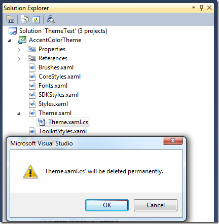
Create the Theme.xaml
At the moment, all styles are only loose files that are not set into relation in a central place. This place will be the Theme.xaml file we're about to create. Since there's no option to create a single XAML file, choose "User Control" from the available item templates:

After that, delete the Theme.xaml.cs file, because we won't need it anymore:
Finally replace the content of the Theme.xaml file with the following:
<ResourceDictionary xmlns="http://schemas.microsoft.com/winfx/2006/xaml/presentation"
                    xmlns:x="http://schemas.microsoft.com/winfx/2006/xaml">
    <ResourceDictionary.MergedDictionaries>
        <ResourceDictionary Source="/AccentColorTheme;component/Brushes.xaml" />
        <ResourceDictionary Source="/AccentColorTheme;component/Fonts.xaml" />
        <ResourceDictionary Source="/AccentColorTheme;component/CoreStyles.xaml" />
        <ResourceDictionary Source="/AccentColorTheme;component/Styles.xaml" />
        <ResourceDictionary Source="/AccentColorTheme;component/SDKStyles.xaml" />
        <ResourceDictionary Source="/AccentColorTheme;component/ToolkitStyles.xaml" />
    </ResourceDictionary.MergedDictionaries>
</ResourceDictionary>
All we do here is create a resource dictionary that contains all the individual style files. Please note that I am using the full path for the XAML files in the form "/[Assembly];component/[FileName].xaml". It took me some time to figure out that this is required even though the files are located next to the Theme.xaml.
Finally make sure that the Theme.xaml build action is also set to "Resource" (instead of the default action "Page").
*Note: If you don't want to use the full set of styles (for example leave out the toolkit styles), you are of course free to limit the set of files here. *
Optional: Create a strongly typed theme
A strongly typed theme provides a more comfortable way to set an application-wide theme later on (as opposed to explicitly wrapping parts of your application in a theme). To create that type, add a class file to your library project and name it like you want to name your theme class, for example "AccentColorTheme.cs". The code for a theme can look like this (taken from the Toolkit theme sources and names adjusted):
public class AccentColorTheme : Theme
{
    private static Uri ThemeResourceUri = new Uri("/AccentColorTheme;component/Theme.xaml", UriKind.RelativeOrAbsolute);

    public AccentColorTheme()
        : base(ThemeResourceUri)
    {
    }

    public static bool GetIsApplicationTheme(Application app)
    {
        return GetApplicationThemeUri(app) == ThemeResourceUri;
    }

    public static void SetIsApplicationTheme(Application app, bool value)
    {
        SetApplicationThemeUri(app, ThemeResourceUri);
    }
}
The Theme type is part of the System.Windows.Controls.Theming namespace and requires that you add a reference to the assembly System.Windows.Controls.Theming.Toolkit to the library project.
How to use the pack
From there, you can use your library like you would use any of the built-in theme packs of the toolkit. In particular you have to do the following: First of all add a reference to the theme class library project or assembly to your Silverlight project. Then, for example, directly use it in your XAML, like this:
<toolkit:Theme x:Name="ThemeContainer"
                ThemeUri="/AccentColorTheme;component/Theme.xaml">
    <Grid x:Name="LayoutRoot"
            Background="White">
        <Button Content="Click me!"
                Width="150"
                Height="40" />
    </Grid>
</toolkit:Theme>
Once again: the type "Theme" is located in the assembly System.Windows.Controls.Theming.Toolkit, so make sure you've added a reference to that too.
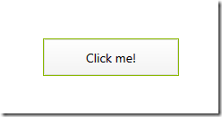
When you run the application, you will see a nicely styled button using the Accent Color Theme like this:
Note: If you receive exceptions at runtime about types that cannot be created, then you are missing assembly references for the defined styles in the theme pack (most likely toolkit assemblies). Add those assembly references to your main Silverlight project, or if you don't use the controls in question consider removing the styles from your theme pack class library.
Sample application
You can find an online sample version that has all of the four application themes converted to theme packs as well as most of the Toolkit theme packs here:
I've disabled two of the toolkit themes as they apparently break switching back to other themes once they are applied. The source code contains comments and further links about this. You can download the full source here:
Tags: Silverlight