
Taming the treeview
Published on Wednesday, July 8, 2009 12:49:54 PM UTC in
Programming

Dieses Post stammt aus dem ursprünglichen "Mister Goodcat"-Blog bei Geeks with Blogs (2009-2010).
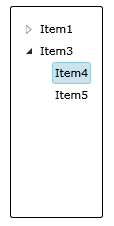
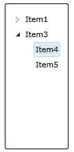
It seemed like a simple task. In one of our Silverlight applications, we're using the tree view control from the Silverlight Toolkit. A colleague of mine was instructed to remove all of the hover and selection effects from the tree view items. After struggling with what seemed like a five minute job for more than two hours, he gave up and came to me for advice. Here's what the default design of the tree view looks like, with one of the items selected:
When you want to change parts of a control's default behavior, it's always a good idea to use Expression Blend instead of Visual Studio, because it gives you the possibility to copy the existing templates and use them to work from there. In Visual Studio, you would have to build a new template from scratch, which often is tedious work, especially for complex controls. In Expression Blend, you simply select the control and the according menu entry:
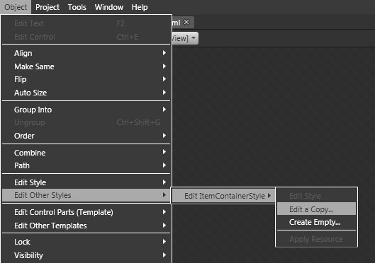
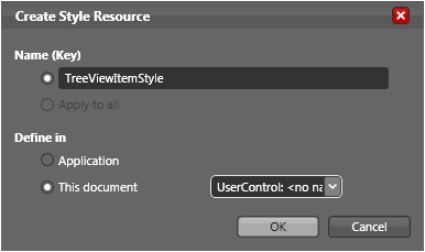
You have to add a key that identifies your style so you can apply it to controls, and you also have to choose where you want to store the new style.
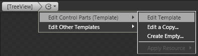
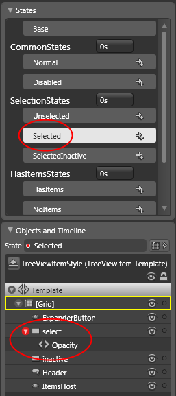
Once you've created the new tree view item style, you can edit its template:
In the current case, after inspecting the available states you'll find out that there are two rectangles ('select' and 'inactive') in this template, which are made visible in the 'Selected' (and 'SelectedInactive', respectively) state by manipulating their opacity property. We just wanted to remove those effects completely, so I simply deleted both rectangles. If you wanted to adjust the colors or other parts of the effects' appearance, that's the place where you would do that too.
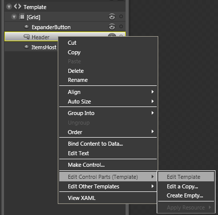
Well, after applying the new ItemContainerStyle to my sample data, I was surprised to find out that not all of the effects were gone. In fact, hovering an item with the mouse still brought up a light blue rectangle around the item's content. I checked again with the template and realized it didn't even have the involved states defined. So where does this additional highlighting come from?
The answer is that the header component within the item template is build from child components as well. Simply select it and choose to edit its template:
You can see that the header is built from another rectangle (with the suspicious name "hover") and the content itself. The hover rectangle is made visible depending on the current state.
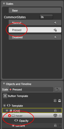
After removing that rectangle, we finally had a tree view control without any effects for selection and hovering at all (but with all the other functionality, like expanding and collapsing items, left intact).
When I look around the net, I see a lot of people struggle with finding the locations where properties like these are manipulated. Even with the help of Expression Blend it can be confusing, and simple tasks like "how do I turn off x" or "how do I change the color of y" can turn into amazingly time-consuming nightmares. Once you get used to the concept however, things will get better every day :). Hopefully I could give you a small push into the right direction for your next tree view item emergency...
Tags: Geeks With Blogs · Silverlight